Eight interviews cut the two top-scored features from the MVP
Plantify: how a scored list of twenty hypotheses lost its top two to the people it was for
· 4 min read · Nikita Miezhenski
Plantify is a plant care app. You point the camera at a plant to find out what it is, keep your plants by room, and get care advice and a diary for each one. It came out of the product design course that opened a Russian national hackathon in 2025. I wrote the hypotheses, ran the interviews myself and designed the app. It stayed a design; the course didn’t go as far as code.
Twenty hypotheses, scored
The course started from problems rather than features. People don’t find reliable advice, don’t know what plant they have or what is wrong with it, forget to water, lose interest, and the plants die. Each problem became a hypothesis written as “problem → feature”, twenty in all, from identifying a plant by photo to a forum.
I scored each one from 1 to 5 on six criteria: how much people need it, whether our team could build it, the market, how unique it is, how well it fits current trends, and what it would take. “Plant of the day”, short stories about plants, came out on top with 28. An AI chatbot came second with 25, then watering reminders, a fertilizer picker and a growth diary with 24 each. The marketplace and the forum came last.
Eight interviews
I planned seven interviews, two people aged 30 to 50 and five aged 14 to 30, and ended up talking to eight. The guide had thirteen questions about their plants and how they look after them, three about AI and five about stories and quizzes, because those two ideas had scored highest.
Six of the eight look things up in Google, and a search takes 5 to 15 minutes. “Really inconvenient, slow,” a 17-year-old said. None of them had used a plant care app. Seven wanted help picking fertilizer and pots. Only one trusted AI outright; five would trust it on a condition: an expert checks the advice, it shows photos, or they check it in Google anyway. Only one watched stories in other apps. “No, I don’t notice them,” said the youngest. Quizzes could work if they were short: “A long quiz, too lazy. One question, I’d love it.”
Scoring ideas at a desk put the two that nobody wanted on top.
What changed
The interviews overturned the top of my table: stories and the chatbot were the ones people didn’t want. The chatbot left the MVP. AI stayed only where it shows a result you can check: point the camera at a plant and it names it, with its Latin name, how much light it gets and its condition. Stories went too, after people didn’t notice them in the prototype test either. The same test showed that the button for adding a plant was hard to find, so I fixed it.
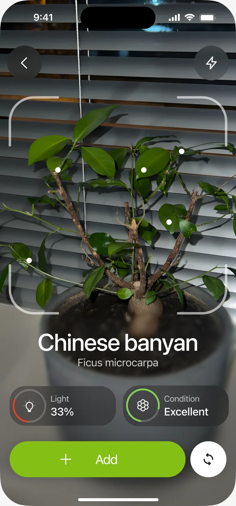
Other hypotheses went in as they were: live tips while you aim the camera, the personal catalog as My plants, and the growth diary as a tab on every plant. Everything else waited. On the full product map, the subscription, a family plan, achievements, the chatbot and data export are marked for later. The MVP keeps one path: sign up or skip it, see your plants, open a plant’s card and its diary, or add a plant by photo, check what the camera found and put it in a room.
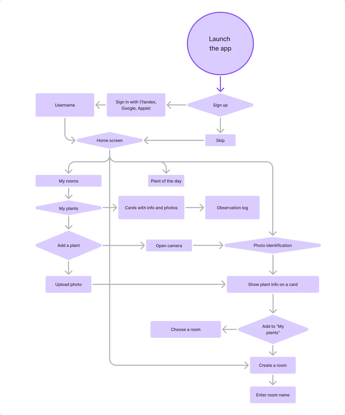
Eight conversations were enough to overturn the table, and they cost less than designing either feature. I now put them before the scoring, not after, on every project.